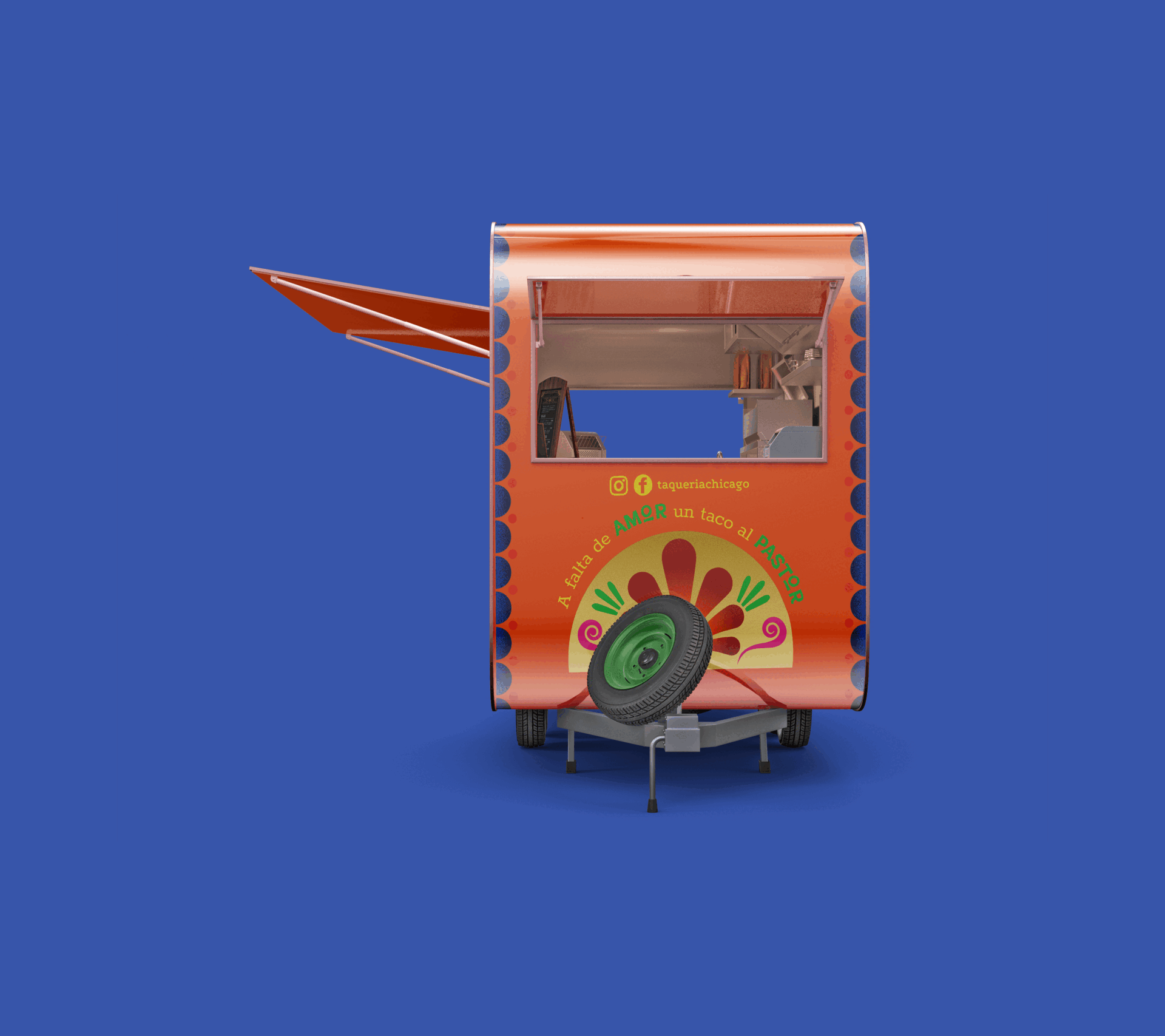
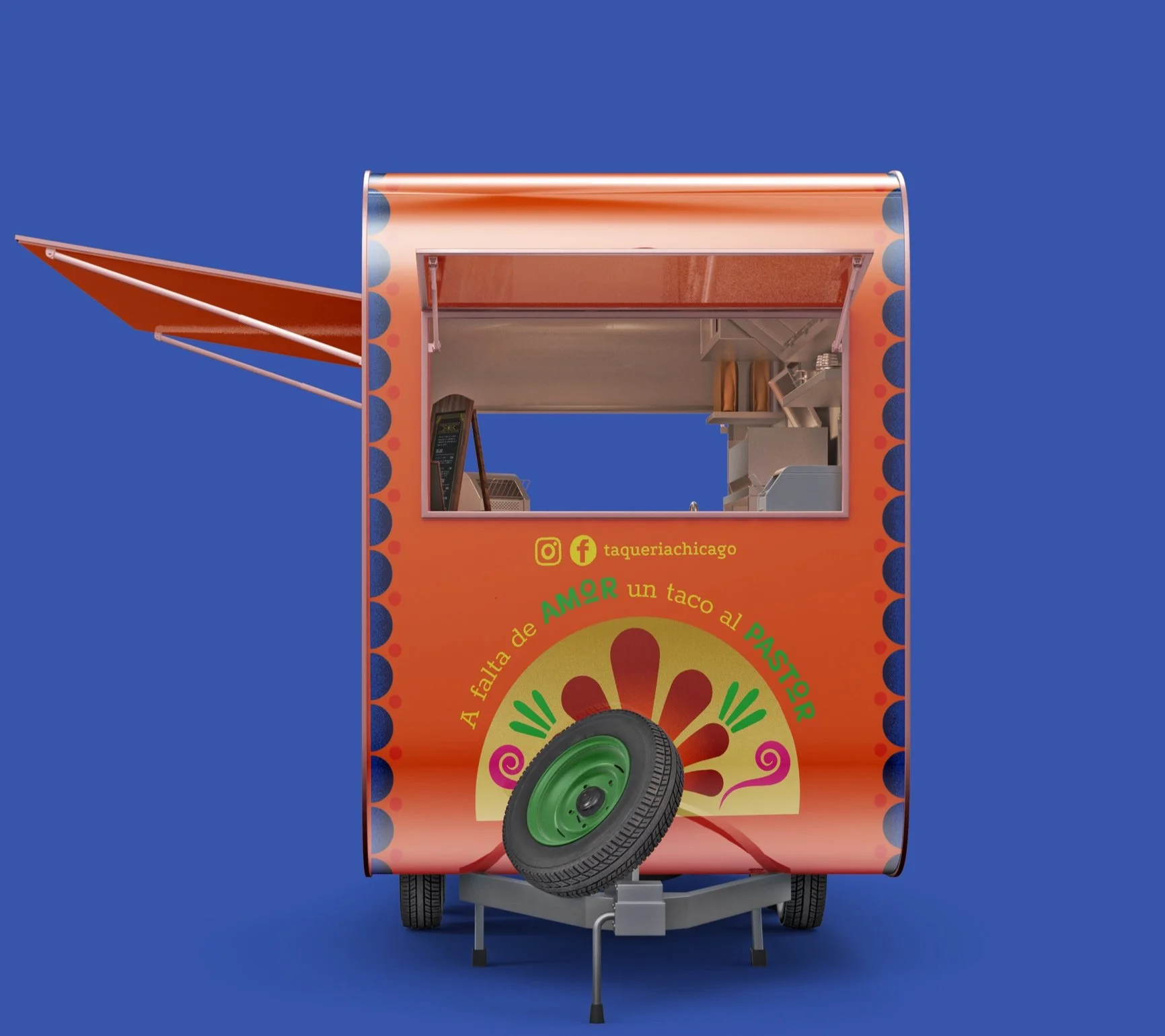
TAQUERIA CHICAGO
Branding, packaging | 2024
This food truck design is based off of the restaurant Taqueria Chicago, who is known for their authentic Mexican street food. The talavera inspired ingredients act as a symbolism for the food truck, that it is a container for the food inside just as talavera is a container for food as well. The goal for this truck was to represent the authentic bold and party culture of Mexico, along with the generational aspect of Taqueria Chicago

THE CONCEPT
The concept for Taqueria Chicago’s food truck was centered around Talavera pottery. This is a well known form of pottery within the Mexican culture which is known for its vibrant colors and intricate patterns. Talavera is often seen within restaurants to hold chips, limes, salsa, and even the main dishes.
Therefore the ingredients on the food truck having talavera patterns create a metaphor for the truck, which is also a container for the food inside.
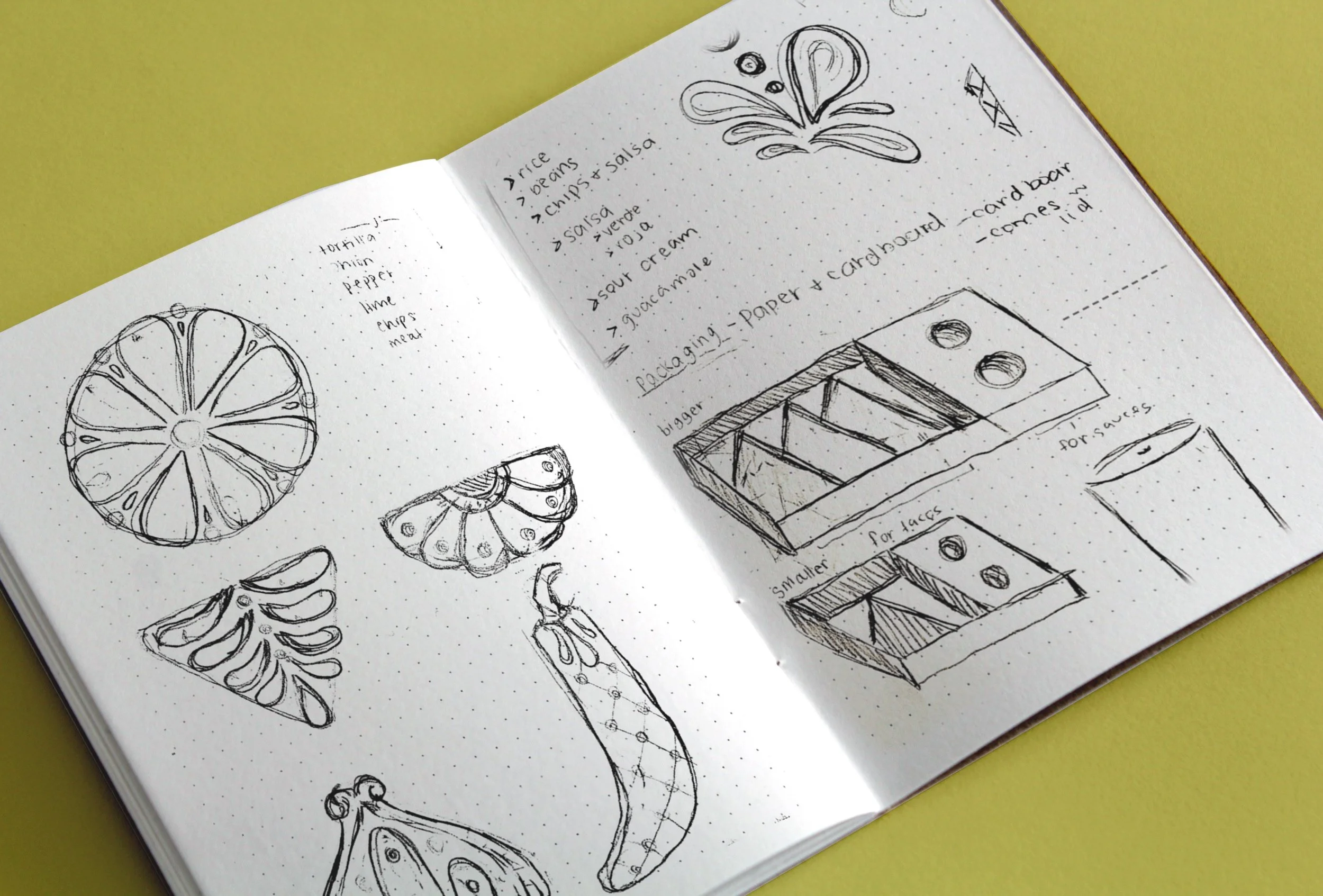
The Sketches
I wanted to utilize talavera patterns inside of the ingredients to symbolize the container aspect, these patterns are also used on the for truck. Talavera is also seen inside of Taqueria Chicago so it is used as a reference to the inside of the restaurant


The Illustrations
Taqueria Chicagos menu stays the same but changes ingredients every now and then. The ingredients chosen are the main ones that have not changed, showing the generational aspect yet staying true to its cultural roots.


The packaging
The packaging for the truck also plays into the generational aspect, by making the colors of the ingredients change. It symbolizes how the ingredients have changed in some way over time yet stayed the same in the end


